
Digital Walkthrough – Dragon Thrall
From April 2007. Nowadays I tend to completely work in Photoshop CS, but many of the techniques are the same no matter the software. This is a fairly rambly post as it's taken from notes I made while painting. This is NOT the way I work for client work!!!!! This was a personal face study that I built a painting around. I now plan things!
This painting was completely unplanned. It started out as a gothic vampire piece… ended up something completely different! These are some of the notes I posted to LiveJournal while painting, and subsequently featured in February 2008’s EMG-Zine.
Normally it’s a good idea to plan a painting. You should work out your composition details, color schemes, lighting sources and other technical details, but sometimes it’s more fun just to get in there and paint! Some of my best paintings have been the result spontaneity, experimentation and sheer desperation to fix a mistake! It started out as an exercise in skin tones, turned into a modern vampire piece and ended up having dragons! Hopefully you’ll learn a few things about why planning can be useful, as well as why it can also be fun to follow the rambling path your muse sets you on!
A few thoughts on digital art and painting software:
There is a plethora of information on digital art available online. This article isn’t a basic A+B=C tutorial. It’s more a discussion on the creative process I employ while painting digitally. For this article you will need a basic understanding of Adobe Photoshop or similar software and have access to a digital graphics tablet (or be really good with a mouse!). Access to Corel Painter would be handy too, however you can get similar effects in Photoshop with a bit of experimentation and practice.
I use Photoshop and Painter together. I’m not going to argue about which one’s better – because frankly it’s like comparing a banana with a pineapple! They’re both graphic software programs, however they’re designed for completely different purposes. Photoshop is an editing tool which you can paint with. Painter is purely designed for painting, with a few editing tools thrown in. With each new incarnation the blurring of these definitions decreases. I’m sure that if you experimented enough, you could probably get the result you want in either software.
Setting up the canvas
I started the painting as an exercise in skin tones. I hadn’t worked in Painter for a while and thought it was time to flex those painting muscles again. Unfortunately some versions of Painter can cause files to corrupt in native Painter file format (pre-version 5), so I recommend that you either create your file in Photoshop first, or save the files in Photoshop format (*.PSD extension)

Just started painting a face, based on a reference photo of Selina Fenech
Just like painting on paper or canvas, a blank canvas can be very intimidating. I always lay down a color of some type on the background layer just because it’s something to start with. When you plan a painting it’s a good idea to think about the lighting in regards to the background. If you are painting a scene which is sunny, then a warm yellow or warm blue might be a good choice. If you’re thinking about a night scene then start with a dark indigo or a cool blue. If it’s in a forest you may want to think about a green, while a snow-filled landscape may require a pale lavender-blue color.
As I said, this was a practice for skin tones so I decided on a dark maroon to pick up the dark tones in the hair (I’d planned on painting a redhead). Most of the time I apply a lighting filter, or a gradient to make it more interesting – kind of give it a focal point.
The first character I sketch on a separate layer to the background/ canvas. When painting directly onto the computer with a graphics tablet I generally start with a few lines to work out the placement of the head, eyes, mouth, nose and ears. I then work out a few ‘base’ colors that I will use for the skin. I place ‘dabs’ of the color I use regularly somewhere on the canvas:
A mid pinky-brown color – the base color
A pale yellow/ pink color for highlights
A redder tone of the base color used for cheeks and nose area
A purple version of the base color for shadowing
A darker brown-pink for the deep shadows
A light pink-purple (not shown) for blending in areas where the skin is fine and the veins show through.

My colour palette - I tend to try an paint with less grey tones and more vibrant tones
In later versions of Painter you get a tool called a ‘mixer’ where you can place dabs of colour and create variants using the mixing tools. If you are having difficulties with colours try using the colour picker on real photographs and see what ‘real’ skin colours look like. You’ll probably be quite surprised!
Once I have the colours and some lines down I begin to paint. For this face I used Painter’s digital Airbrush set at about set at about 10% opacity, 100% Resat, 0% bleed and 0% jitter. I vary the brush size from about 150, right down to 2 or 3.
I spent about 2 hours to get to this stage.

Lips details
A few notes on skin tones:
Every person has a different skin tone and texture – we’re not all a standard ‘flesh tone’, straight from the tube
Men and women also have slight variations in colouring
Different nationalities have different skin tones. Some have ruddy complexions, others a yellow undertone, while some have dark skin. Study photographs, place them next to each other and note the differences
Skin tones reflect the colours around them. If you are wearing a purple shirt, you will get some reflection under your chin depending on the lighting. If you are standing next to a yellow wall, the side facing the wall will reflect the yellow.
The colour of the lighting impacts on skin highlights and shadows. If you use a yellow light, the shadows of the skin are generally the complementary colour (in this case purple).
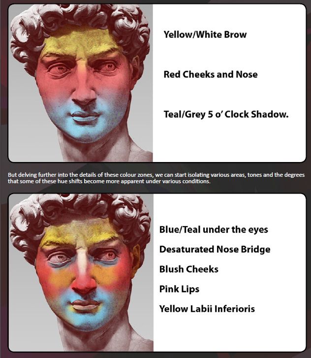
I don't know the origin of this picture, but this is the kind of stuff described in Don Seegmiller's book (if you know the source, let me know)
One thing I remember reading (Don Seegmiller in his book Digital Character Design and Painting) was the fact that the strip across the nose section of the face is pinker than the rest, while under the eyes should be purplish-blue as the skin is so delicate here. I recommend his book for color theory, regardless of the painting medium! In fantasy art, the ability to create convincing skin tones in important, particularly if painting something like a Drow, or even an alien with blue skin
Blue, green and everything between. Different skin tones don't just mean one colour

A light skinned Drow
Adding the hair
Hair is basically made from 4 colours which I vary the opacity and size of the bush. The illustration below shows the four colours and the way I build up the hair.
A mid tone
A light tone
A dark tone
A very light tone for the highlights

Loose steps to painting hair
Why having no ‘theme’ for a painting can be a problem!
Like most sketches where I don’t think about anything much except picking up the ‘paintbrush’, I get to a point where I start wondering about things like ‘does she want straight or wavy hair’, ‘does she wear modern or old fashioned clothes?’, ‘what the heck do I do with the background?’.

Started off as an urban fantasy portrait
At this point I was listening to rock music and it was about midnight so I decided it should be a vampire/ gothic piece. Originally it was just going to be a strapless dress but it ‘felt’ wrong. I added a leather jacket and a cameo choker. I planned on having a night sky, maybe the silhouette of a building. This means that dark blue is going to have to replace the maroon canvas colour. A guy is going to be behind her, all ‘vampy’ and hopefully pretty good looking! I took a break and came back to the painting after some food. I’d been working for about two or three hours and realised that I’d changed the angle of her torso mid painting which is why it is looking odd. This is why it’s a good idea to plan your painting before you begin! You can waste a lot of time working on something, only to realise there is an inherent flaw in the drawing. So I really had a think about where the painting was going… which was feeling like the great digital dustbin in the sky!

Continuing to paint, still without much purpose. Note how I use colour patches beside him... I used to do this all the time, now I just use a second window

Face detail of the male, still fairly rough
Unfortunately I only had a clear picture of the character’s faces so I was basically very aimless when painting. I get bored with details so I moved onto the male character. I knew I’d have to revisit the female character but something was really bothering me about her and I didn’t want to think about it too deeply. I spent about 2 hours working on the guy. Notice that his skin base is slightly more yellow. Guys’ faces are also more angular than females (generally) so I painted in a more aggressive manner, not blending as smoothly as for the female. I also added in some texturing with a ‘captured bristle’ brush.
A note on photo-references:
When I work from photo references I try to avoid working directly from one reference for copyright reasons. Each painting I’ll often work from at least half a dozen images (which I normally collect AFTER I’ve made the initial sketch). I also have a huge collection of images that I’ve harvested from the net, reference books/ CDs, personal photo references.
I also like working with greyscale images and using small images so I can’t rely upon them too heavily. This way I can make the colour up on the fly. I also find that it helps to practice sketching in greyscale. You focus on rendering the form rather than colours, which teaches you a lot about volume, lighting and texture.
Back to the painting
Further refinement of the characters
I spent another 2 hours on this (up to about 10-12 hours now). I kind of became obsessed with finishing his face. I put him in a leather jacket and white shirt and played around with where his arm should go, ultimately deleting it. I changed the background colour to a near black colour while I was playing with things. I’m still not convinced about what’s going on in the painting. But I’m happy to let my mood decide what’s going to happen. I enjoy these kinds of paintings because I just let the paintbrush take me where it wills. However it’s getting to the stage where I will need to decide if I’m going to do something with this painting, or just file it as an experiment.

Face is pretty much done
I’ve got more details to do… tidying up his eyebrows, giving his skin some texture around the jaw line, finalising his nose and lips, and one of his eyes is slightly off (shadowing and shape’s wrong… but I’ll fix that up later.)
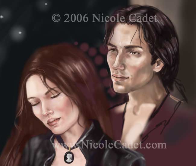
Vampire goes Renaissance?
I’m heavily influenced by music. When I paint I listen to a variety of music, and often it can influence what I paint. I stopped listening to my Dishwalla album and put on Medieaval Baebes… at which time I thought to myself ‘this is just two people standing together, there’s no fantasy here’. So the painting went Venetian 16th century!
Vampires go Renaissance?
I’ve obsessed over historical costume for as long as I can remember and one of my favourite paintings is Rafael’s La Donna Velata. I deleted the leather jacket and replaced it with a front-laced bodice over a creamy chemise. This costume was popular with working classes as it was comfortable and didn’t get caught up while working. I think it is important to think about the clothes you put your characters in… it is part of their story. It can suggest what they do and their status in society, it can also indicate if they’re light and fluffy, or rigidly straight-laced.

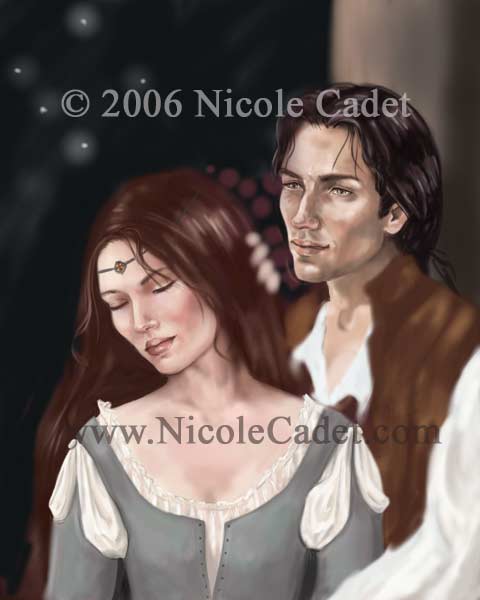
Detailing the bodice
A few hours work went into the dress. It’s not finished yet. This is only the basic form. I’m debating about patterns and colours. The more elaborate fabrics tended to be used a few decades after this dress style was popular, and only by the wealthy, but it’s fantasy so I guess I can do what I like!
Working out the background:

Adding some background... seeing my layout
I have decided a night sky doesn’t suit the lighting of the characters, so I’ll do a dawn/ dusk sky. I flicked through some reference shots of skies and started laying down some colours in Photoshop with a large airbrush tool. Not much I can say about skies except for the light will reflect on the characters, which is why it’s not a strong sunlit scene. In this low light there won’t be much reflection or shadow.
I’m still playing around with the idea of having a column behind the male character. The sky’s getting close to being completed. I’ll start looking at the lighting in the painting later on… normally that’s something I do in the planning stages for a *proper* painting. It’s up to about 200MB… time to save a new copy and collapse a few layers I think.
On a side note, I’m not happy with the poses or placement of the characters. They’re too rigid. There’s no connection between them, I need to bring them together somehow. I’ve started to realise the girl’s body looks too small and much too straight on for her head. I’m going to have to repaint whole chunks which will be a lot of extra work. You can do this with digital, however if I’d planned the painting I wouldn’t have to be ‘fixing mistakes’ at this late stage!
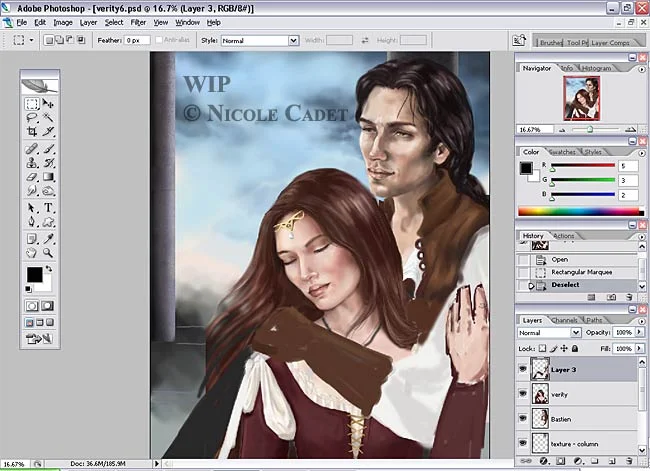
Reworking the poses and costumes
I added some columns and moved the characters closer together. Each character is on a separate layer and I often take a copy of a layer to do the modifications (in case I muck it up!) I also do iterative saves… I have 7 versions of this file from various ‘major’ points from within the painting.
I like the placement better than the previous version, but I know that I’m going to have difficulties with his arm placement. I also don’t like her headpiece. I haven’t spent much time on it, but it just looks wrong – far too elaborate. I’ve got a feeling that she’s not the kind of girl to wear masses of jewellery! The pose is still disjointed. Why is she moving away from him? It doesn’t exactly look like a comfortable pose. Is he trying to put on her cloak, take it off, or strangle her? When you paint, you have to think about how the painting could be interpreted.
The home stretch
Working out the male's body and some background details
Unfortunately I sat down and painted in one marathon session (without taking saves part ways through). Inspiration struck and all at once I knew exactly how the painting had to look. All the missing elements fell into place. I had the narrative that went with the painting, I knew why they were standing together. The pose was vital to the scene. I think it is important to know ‘why’ things are the way they are. Sometimes it can be as simple as ‘because it looked right’ or ‘because I want the viewer to feel scared’, but with more narrative pieces, the ones that work best tend to make every piece of the painting into something vital to understanding the whole piece… like clues in a mystery novel.
I ended up moving her directly under his chin and slightly curved into his body and moved his arm so he’s supporting her, rather than embracing her. The sky remained unchanged however the bottom needed a focal point – it was too empty. The forest and cliffs are a scene I’ve used in numerous paintings… they are like an old friend – something quick and easy.The lake came next, and the glow lights (which have no real meaning, but they ‘fit’ with the mood of ‘magic in the air’). It still was looking empty. In the story in my head the character’s connection is through dragons. I’d already planned on giving the female character a dragon necklace and the male character golden eyes, however I think a more ‘literal’ representation of the dragon was needed. The placement was deliberate in that I wanted the viewer to follow the motion from the dragon to the characters and back around.
Often when I’m working without reference (like I did for their poses, I try to work out their bodies in their entirety. Even though it still looks a little ‘wrong’, because of the angle of his body, his shoulder is right behind her hair. I tried extending his shoulder but it didn’t look right either.

Not quite there... adjustment layers
I added an Overlay layer to do some lighting along the side of the girl’s head and the columns. There are 13 layers in the final version (after I collapsed the multiple character layers from the previous version).
I thought I was finished. I posted it online, added it to a few galleries, but something was still a little unrefined. So I stepped away from it for a week or two (see further down for the revised version).
Some notes on Composition
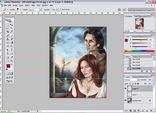
Rule of thirds
I like working with the Golden Mean (also called the Golden Section/ ratio/ proportion/ The Divine Proportion). It’s a way of dividing up a painting so that the image is artistically and geometrically pleasing. It’s based on mathematical principles and can be seen in nature in such shapes as nautilus shells. Below I’ve added guidelines in pale blue that divides the painting into thirds. Notice how the parts of the painting that your eyes are drawn to tend to fall along the lines, with the light in the forest being at a ‘focal point’, where the lines intersect.

L shaped composition
The painting’s composition loosely fits into what is called the ‘L’ Composition

Leading the eyes with V's
It could also fit in with ‘V’ or ‘triangular composition.
The trick is to try and get the viewer’s eye to follow the movement from one point of the painting to the next
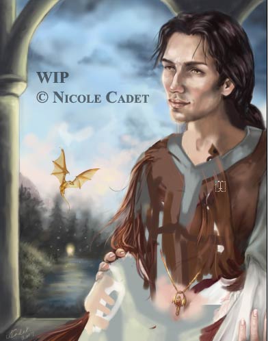
Final Piece:

Final image
I went back and refined it a little… just added a few more details to the hair, fixed the column and tidied up the tree-line. There are still aspects I’m not entirely happy with, but I’ve spent enough time on this painting… I don’t want to overwork it.
So 20 or so hours later, here’s the final piece and the story that goes along with it:

Detail of male character

Text I wrote to go with the painting
The dragon-thrall caught her, its silken threads binding her mind to the golden dragon completely. Kara and the great beast launched upwards as one, pushed from powerful back legs. Muscles flexed as the wings extended fully, capturing the wind and propelling them higher still. Freedom! She threw back her head and laughed, the rumble echoing from the surrounding cliffs. The sun and sky called to her, daring her to fly higher and faster than she could ever dream.
She wheeled to the right as she caught movement in the valley below. Ruby eyes fixed on the deer. Tucking her wings to her side, she dove towards the earth, pulling up just above the forest, the trees bending then snapping back in her wake. Kara could taste the hot, sweetness of the blood. She wanted it, lusted for it, she had to have it. It was a burning pain that drove her.
Something yanked at her. Whipping her head around in annoyance she couldn’t see a rider. Focusing on the deer again she snarled as the strong will commanded her to stop. The hunger tore at her, but still he cajoled her, coaxed her, and compelled her. Snarling and baring her teeth she snapped at the unseen force. Finally he dominated, wrestling control from her. Emotions flitted across her mind – fury, hatred, pain, desire. And then she was in her own body again.
Rhys caught Kara as the dragon-thrall released her. He’d been with her throughout the flight, his golden eyes seeing just as the dragon had.
“Now do you understand?” he murmured, his breathing still ragged from the clash of wills. She shuddered, glad to still be in his steadying embrace.
“It helped, but I don’t think I’ll ever understand them, not the way you do.”
Prints and products are available here from RedBubble , painting can be found in the Dragon Fae Oracle as the Lovers card.